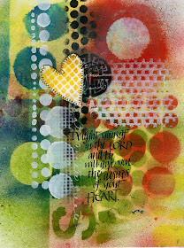
Since it is so extremely hot and the mosquitos have won the battle for now, I must be content to spray inside. This is a different look than the spray paints but I might even like it better. I will probably use a combination of both when I can get back out to the red shed. This is sprayed with Maya mist, Adirondack spray and Glimmer mist. Love them all.

I wrote this with black gouache without putting any type of fixative spray. Big mistake but it came out ok even though it started sliding around a bit. I hate it when that happens. I should know better by now. Watercolor over thicker layers of acrylic doesn't want to stick.

I couldn't decide what to do with this one so I just left it for now. The darker color on it is my favorite new color of Adirondack--Wild Plum. I don't know what is coming over me--I have never been a plum of any color fan. But this--I love and it goes so great with the Butterscotch Adirondack spray. Yummy! I have one more I am working on that I will post tomorrow--maybe. It wasn't was coming together very well.

These are beautiful as always. Like you I'm not a plummy/pink fan, but this plum is delicious. Appreciate your sharing what products you used to get the various effects. and of course the thing that sets it all of is your beautiful lettering.
ReplyDeleteIts funny how our favorite colors always change. Last month mine was green gold and now its cobalt teal.I do like that wild plum color! All your pages are beautiful!
ReplyDeleteHi Martha! Your title got me laughing already! I LOVE your new pages. I have new materials and supplies, but haven't ventured out into this world quite yet...!♥ Lovin' the plum and butterscotch! Your words/lettering are just beautiful.
ReplyDeleteLove your sprayed pages. They're so full of color.
ReplyDeleteBeautiful!! I need to use my Adirondack sprays more. I love that wild plum. Do you have "stream"? I love that color too!! :) I think I will get them out and play with them this week.
ReplyDeleteOh, I love them all. The sewn on heart on the first one is a nice compliment. And I love all colors in the plum family. So that last one would be a favorite.
ReplyDeletepretty, pretty, pretty
ReplyDeletePlum is my very FAVORITE color - one shade of purple or another always has been but it's been plum for a long time now.
And I love adirondack sprays. I wish the glimmer mists were permanent like they adirondacks.
these are just great! i love them.
ReplyDeleteMartha, are you buying your Adirondack Color Wash Sprays here in town or are you ordering them online. I can't find anyone in town who carries them...
ReplyDeleteI love your sprays and acrylics, your stencil and your graffiti, but your chosen calligraphy phrases are exquisite. Which Bible are you using? My KJ is not as eloquent.
ReplyDeleteI love that plum colour. All pages set off your lettering beautifully.
ReplyDeleteI love the verse in #2...It's beautiful, Martha!
ReplyDeleteBlessings~
These are lovely pages and I love those verses.
ReplyDeleteHi Martha,
ReplyDeleteLove how all your pages turned out.
You sooo have it together and make it happen!
Happy creating,
Hugs,
Anna
happy fumes equals happy creating (which equals happy artists!!)! love your new pages.....i'm glad you found a great solution for the spraying in this heat!!
ReplyDeletexox, :))
i so know what you mean! :)
ReplyDeletelove you bunches Marthy!!!
I just got your comment on my blog and I had to come and tell that I don't like the color mauve either. That and peach. I just thought it was funny!
ReplyDeleteLike all your work, these are wonderful.....love the Scripture and the colors you used....
ReplyDeleteIt looks like so much fun......
The title is pretty funny! Love the colors - they look like summer, don't they?
ReplyDeleteI really like experimenting with colors that I've never used--You make me want to do this more. And it's strange when you think colors won't go well together, but they do when you put them in an art piece--OR--the other way around.
ReplyDeleteI love the effects. I like how the colors just blend so beautifully. I need to look into those colors. thanks for sharins. Awesome.
ReplyDeletemagnifique page j'adore les couleurs
ReplyDelete